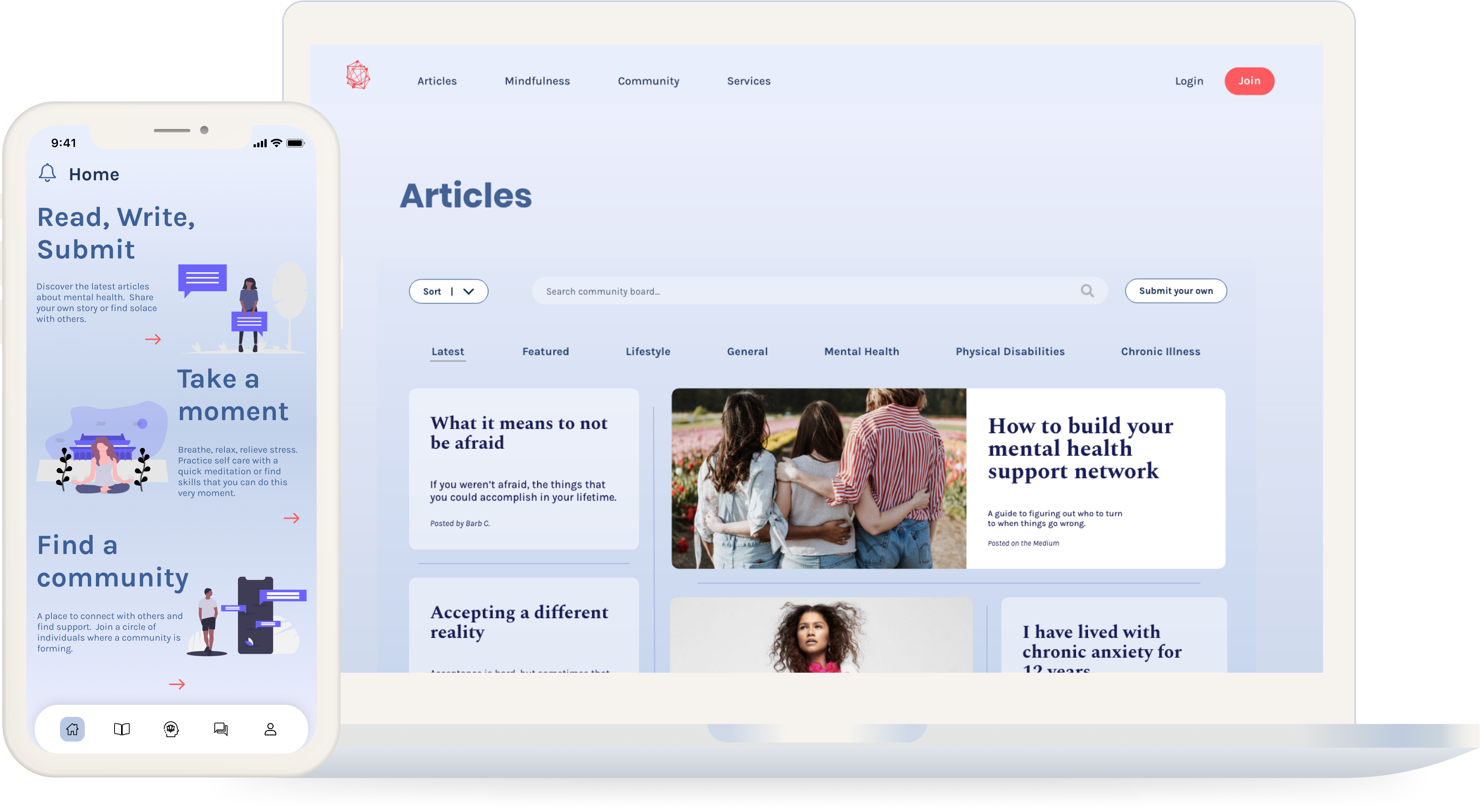
Solace
Overview
A community-driven mental health hub fostering support and connections for well-being.
View Prototype
Role
UX Designer
Project Time
1 Month
Problem
Asking for help or understanding what your struggles are can be difficult. Having a place where others share common conflicts can provide a comfort that one might lack. Many applications geared towards working on oneself and finding help are geared towards one specific area of support. Such as online therapy, only providing therapy and nothing else. Same as meditation applications, only providing meditations but not supplying other resources if that fails to work. Taking all this into mind, I wanted to create a place where it featured all different avenues for one to choose from to work on themselves.
User Research
Developing Solace involved a comprehensive approach that delved into various existing resources
available in the market. This encompassed exploring meditation apps, online therapy platforms,
and self-help programs. Through this extensive research, I meticulously examined the strengths
and weaknesses of each resource, laying the groundwork for the inception of a novel application.
To further comprehend user needs and craft a more user-centric resource, I conducted a thorough
competitive analysis of three distinct websites: 7 Cups, Headspace, and The Mighty. This analysis
entailed a deep dive into their target audiences, internal and external capabilities, as well as
identifying areas of strengths, weaknesses, and opportunities. The goal was to identify avenues
that could enhance recognition and frequency of use, ultimately aiding in the creation of a more
effective and user-friendly platform.

User Personas
In order to formulate user personas, I executed a user survey to gather data from others on their usage of self-help applications, their experience with finding resources for themselves, as well as what their needs and wants are when it comes to their own mental health struggles. Through the user surveys, I was able to discover that:
Taking the user surveys data, I then proceeded to create user personas. Each one highlighting their motivations, needs, and wants. The three personas are unique to each individual, but represent the overall demand of users today.

Jessica
22
New York
Stylist
Motivations
- Always in check with her mental health
- A source that can be of information to others
- Working on herself
Needs
- Community board that can be a safe place to talk
- The ability to chat with professionals
- Ability to submit writing pieces

Joe
32
Detroit
Freelancer
Motivations
- Enjoys connecting with others
- Passionate about helping others
- Learning new skills
Needs
- Ability to accessed anywhere
- Community boards
- Articles about mental health

Sophie
36
Seattle
Customer Service
Motivations
- A place to disconnect from work
- Focusing on herself
- Developing skills to cope more efficiantly
Needs
- Customizing her own needs on her profile
- Can be accessed without internet connection
- Inspirational messages to read and save to her profile
User Stories & Sitemap
Once I had a significant amount of data from the research performed on applications, user surveys, and identifying the problems that have arisen from analyzing each resource, I was able to form the user stories and sitemap. The stories were created first as they served as a stepping stone for the development of the sitemap. In the user stories, I focused on creating a priority list of actions that users needed to be able to execute for optimal user experience. The actions were distributed from high to low depending on importance.
After finishing the user stories, I moved onto creating the sitemap. The tasks previously highlighted in the user stories were then again used in the development of the sitemap and user flows. The tasks that were showing of highest importance were as follows:


Wireframing
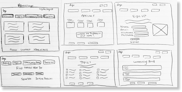
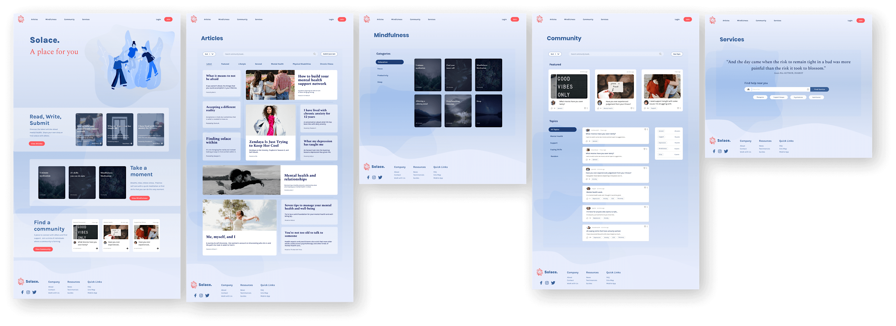
The structure and blue prints of the Solace application were established through wireframes. Building each wireframe with its corresponding content provided important insight into the project. It served as an aid to the construction of tasks that were presented in the user flows as well as an opportunity to test out different avenues of ways to navigate throughout the application.

Branding & User Testing
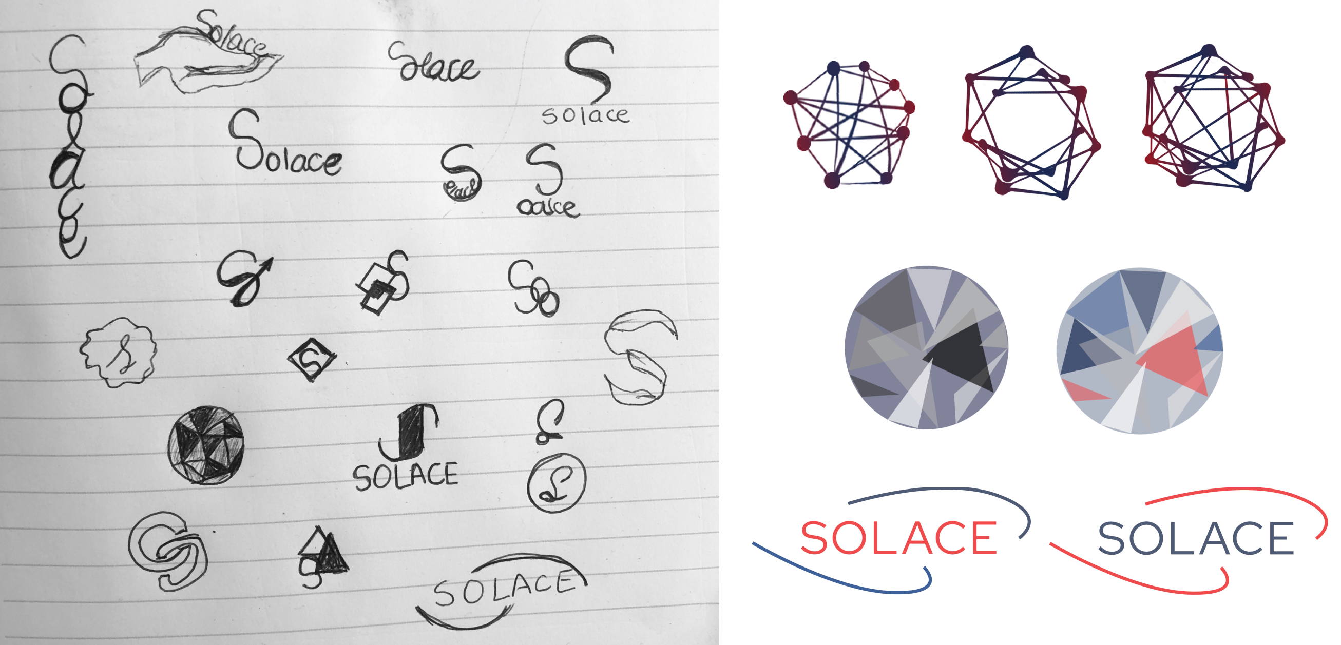
Developing the identity for this project consisted of first defining the name and slogan to be attributed to it. I researched several different possible names and ideas that could represent the community that I was creating. I came upon the word Solace; definition: comfort or consolation in a time of distress or sadness. I played around with the name for a bit, testing it out with different fonts and ways to present it and knew that it was a perfect representation of this community. From there, I started sketching different types of logos. In order to be not too overwhelming but still providing a unique quality in appearance, I was able to design a logo that could be used in several different ways and represent Solace throughout each.
Once the name and logo was established, I moved onto finding a color scheme that matched the identity of a calming but trustworthy display. The colors chosen have been studied to be liked by both male and female and elicit a sense of assurance. To align with the colors, the font style was then selected. It was tested in different weights, sizes, and formats in order to confirm it held its proper identity and clearness throughout.
Logo Design
Color Palette

Prototypes & User Testing
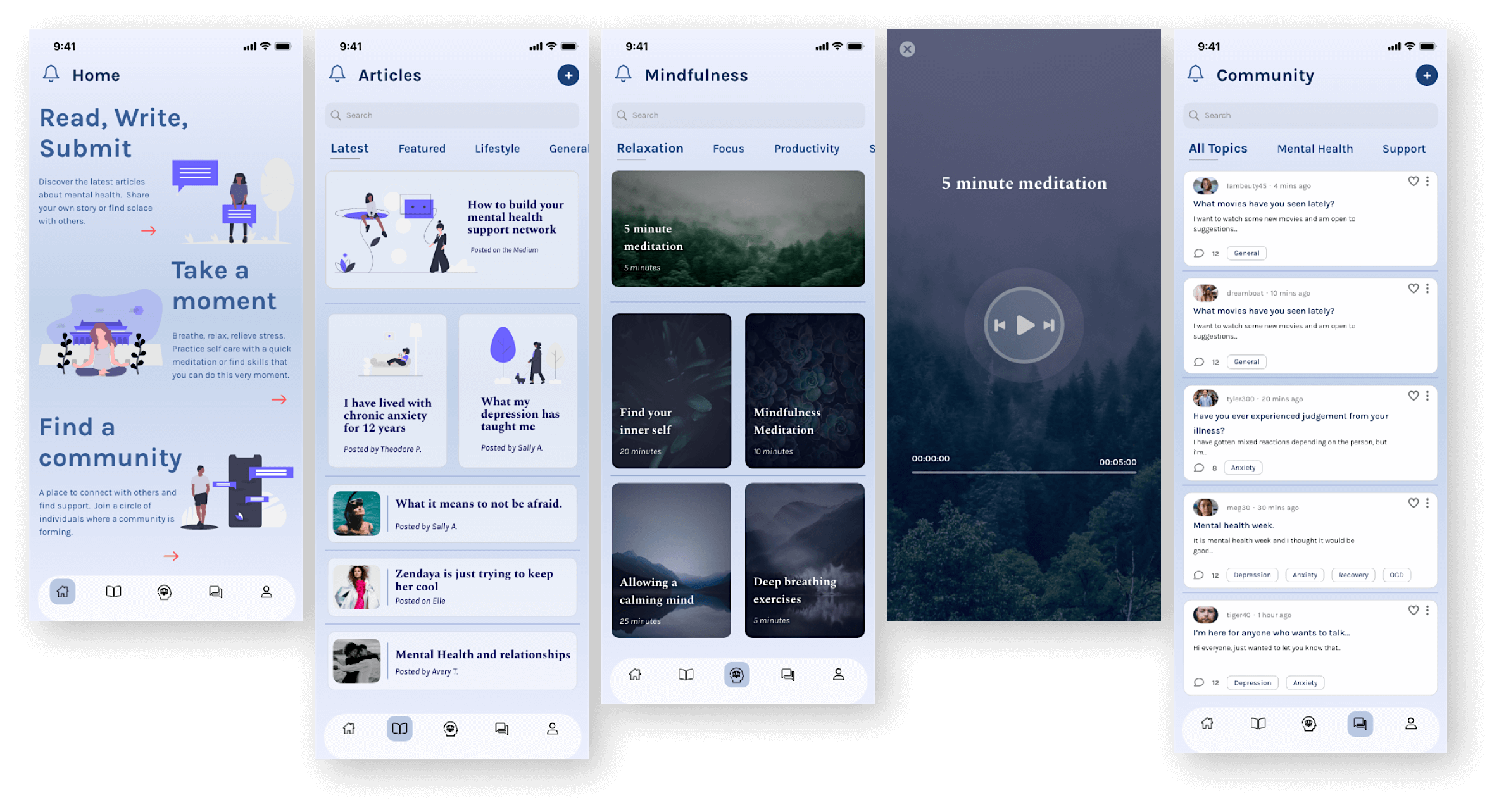
One of the final processes of the development of Solace came down to the prototyping and user testing. The importance of these actions led to further improvements within the functionality of the website as well as the ability to test users on tasks that were laid out in user stories. The tests asked in the user testing were as follows:
The results of the user testing gave me valuable feedback on design changes that needed to be adjusted in order for better functionality. Taking the results, the adjustments were made and better performance was had.
The Conclusion
From the start, I knew I wanted to create an application that was inviting, provided valuable resources, connection to others, and contributed to breaking down the stigma around mental health. The process of researching applications as well as hearing user feedback about what is lacking in this industry was incredibly eye opening. I learned a lot about the importance of embracing inclusivity while providing knowledge to anyone and everyone that uses this application. This project gave me a different outlook on the meaning behind mental health and the ways we can continue to implement applications like this one in the future to keep the conversation going. We have the opportunity to spread the word and normalize what it means to have a mental illness.